
 Kontakt
 Kako nakupovati
Dostava
Svetovalec pri nakupu
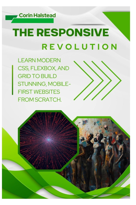
The Responsive Revolution
Learn Modern CSS, Flexbox, and Grid to Build Stunning, Mobile-First Websites from Scratch
 Angleščina
 38 b
38 b
Do 30 dni za vračilo

The Responsive Revolution shows you how to design and build websites that look great on any device.
With step-by-step examples, it teaches the essentials of modern CSS, Flexbox, and Grid - the core tools behind responsive web design.
Inside, you'll learn how to:
Use Flexbox and Grid layouts to organize your pages cleanly.
Design fluid layouts that adapt to any screen size.
Apply media queries to fine-tune your site for phones, tablets, and desktops.
Create reusable style components for faster web development.
Build real-world projects that reinforce each concept.
If you want to code websites that are clean, fast, and professional, this guide gives you everything you need to start building mobile-first web designs that stand out.
Grab your copy now and master the core of modern web design.


O knjigi
Angleščina

Podarite to knjigo še danes
To je povsem preprosto
1 Dodajte knjigo v košarico in izberite dostavo kot darilo 2 V zameno vam bomo poslali kupon 3 Knjiga bo dostavljena na naslov obdarovancaPozdravljeni! Sem Libroamiko, vaš knjižni svetovalec.
Kako vam lahko pomagam?